A unified composition
The letters and four-sided symbol form a single identity. Preserve the approved spacing, proportions and rounded corners.

Visual identity guidelines

Logo · colours · typography · applications
Explore the guidelines
CENTROlink / RGB
These guidelines help you use the approved CENTROlink identity consistently in digital communications and share its assets with partners.
01 / Logo
The primary version is the horizontal dark blue logo on a white or light, uniform background.
The letters and four-sided symbol form a single identity. Preserve the approved spacing, proportions and rounded corners.
The logo consists of closed vector outlines. Always scale it uniformly in both directions.
The first choice for websites, documents, presentations and horizontal communication formats.
A two-line composition for narrow formats.

For icons and contexts where the identity is already recognised.
The symbol serves as the letter O in the logo. Used separately, it must not replace the full name when the brand is introduced for the first time.
Clear space
The module x equals half the height of the graphic symbol. The minimum clear space around any logo composition is x.
Keep text, other logos, prominent image details and layout edges outside the clear space.
This is the minimum. For prominent layouts, allow more space: 2x or greater.
When reducing the logo, preserve the open gaps in the symbol and keep “link” legible. These sizes refer to the width of the identity itself.
160 px
Print reference: 40 mm
96 px
Print reference: 24 mm
24 px
Print reference: 6 mm
Use SVG for digital applications. PNG files are provided at high resolution; inspect them at 100% scale after reducing them to the minimum size. Print results depend on the production method and material.
Use the supplied assets. Effects and unapproved changes undermine the logo’s consistent character.
Select “Correct” to compare with the approved logo.
The width and height proportions have been changed.
Rotating the logo changes the direction of the composition.

Solid shapes have been replaced with a thin outline.
An added shadow changes the character of the identity.
The identity blends into the light background.
A gradient introduces an unapproved logo colour treatment.
02 / Colours
The colour codes come from the supplied CENTROlink reference. Dark blue is the primary identity colour; the other colours provide accents and backgrounds.
RGB 30 / 64 / 121
RGB 66 / 88 / 217
RGB 12 / 21 / 42
RGB 134 / 224 / 176
RGB 184 / 90 / 230
RGB 255 / 255 / 255
Choose a clear pairing of background and identity colours. For longer text, use combinations with a contrast ratio of at least 4.5 : 1.
03 / Typography
Montserrat is the communication typeface. Use the original font family supplied with the assets; do not apply synthetic bold or italic styles.
For large headings
For structure
For emphasis
Ą Č Ę Ė Į Š Ų Ū Ž
ą č ę ė į š ų ū ž
0123456789 € % + − / ( ) @
The package includes nine weights from Thin to Black, each with a matching Italic. Licensed under the SIL Open Font License 1.1.
This is the reference scale for the PDF publication. Scale it proportionally for other formats. Do not recreate the logo lettering using Montserrat.
04 / Graphic system
Three colour versions of the motif are supplied on transparent backgrounds and as ready-made backgrounds. Transparent PNG files can be freely composed in presentations and other layouts.
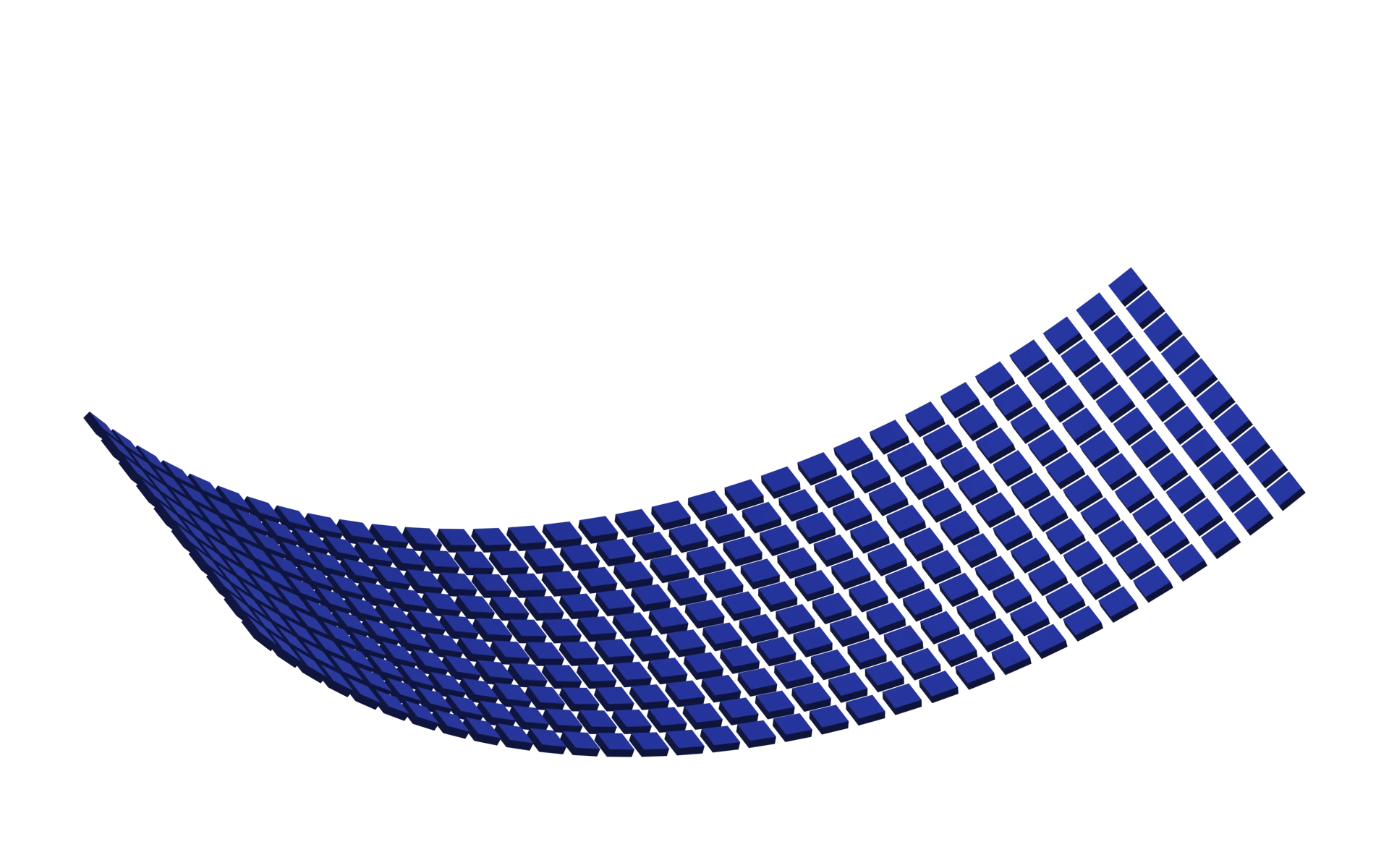
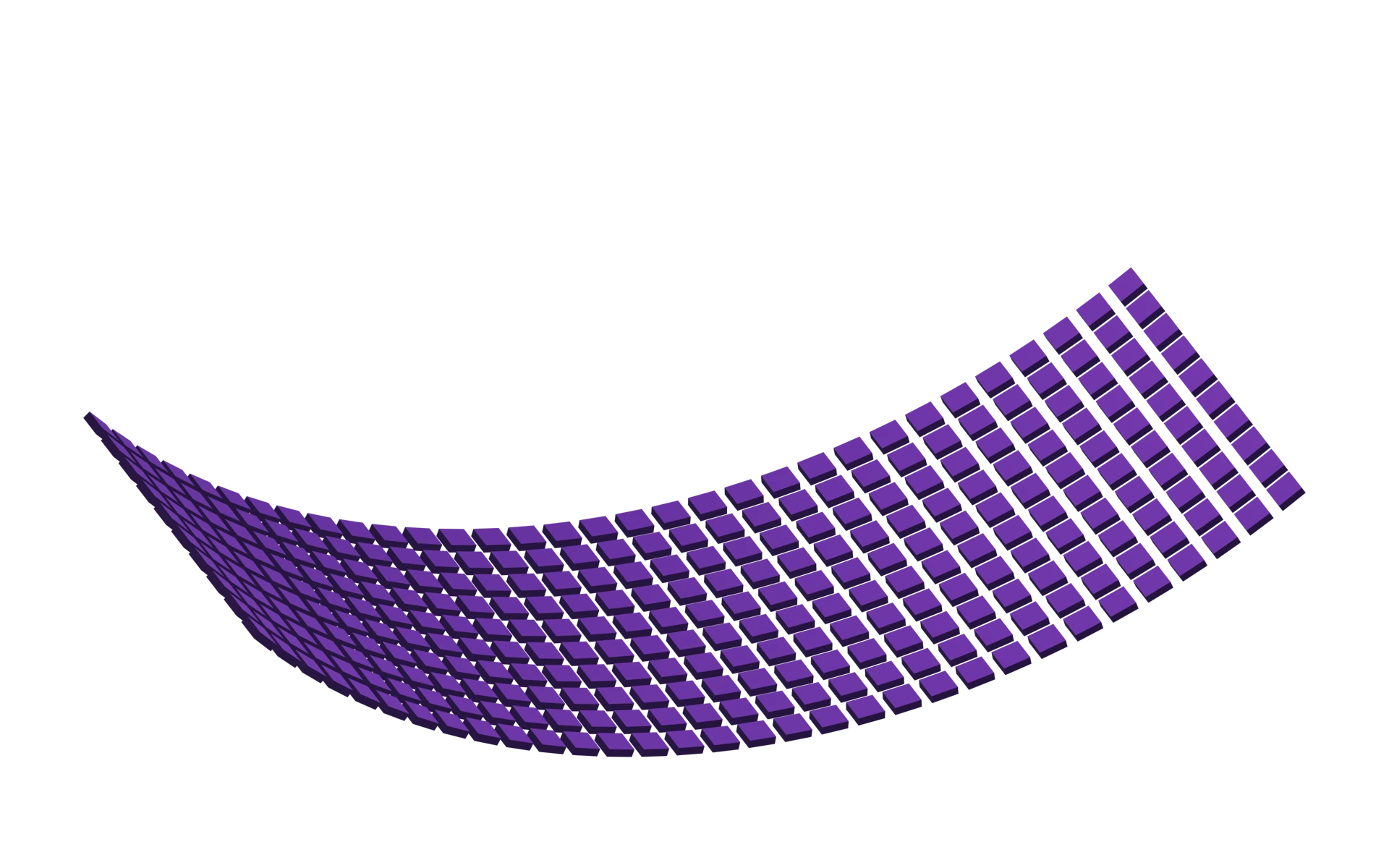
Transparent PNG · 3840 × 2400 px
18 ready-made backgrounds · PNG / JPG · sRGB
Place on your chosen background and scale proportionally. You may crop or fade it within a layout; leave a quiet area for text.
05 / Applications
A 16:9 presentation slide and a 1:1 post show how to combine the square background with the logo and text. The headings indicate where your content belongs.
Use consistent margins, clear left alignment and a steady typographic rhythm. Allow at least the minimum clear space around the identity.
The PDF publication uses 42 pt margins and 12 pt gutters. The heading, content and logo align to a shared grid.
Use an 8 pt module for spacing between content blocks. The grid supports composition; it does not change the logo geometry.
06 / Downloads
Download the original assets. Choose the appropriate composition, colour and format for your application; install the Montserrat family for text.
SVG for websites / PNG for presentations / PDF and AI for design layouts
